
Monday, 30 June 2014
Wednesday, 25 June 2014

Monday, 23 June 2014


Tuesday, 17 June 2014


Tuesday, 10 June 2014
| Photography Worksheet |
~ My work is about the way different cultures in our society have different views and perspectives on each other. At the end of my folio I am aiming to show everyone that, it does'nt matter who you are where you come from, what you are, be proud of you are; be be proud of where you come from. That is how I came up with my concept name; Knowing Your Roots.
~ Senol Zorlu, Sarah Cheng-De Winne, Bettina von Zwehl, Anne Collier, Hans Eijkelboom
~ Senol Zorlu for the emotions being brought out in my photographs. Sarah Cheng-De Winne for the composition she uses and she portrays it through a feminism outlook; some examples are the way Tess Harding, Estelle Kei and Craig Westenberg are positioned. Bettina von Zwehl for the group of series that I will the start my board with and my work book research. Anne Collier for the photographs on the boxes that I have not yet taken or brainstormed. Hans Eijkelboom for the way he uses people in society to enhance the idea of individuality and having them to wear the same thing.
~ I do have enough work for panel 1 but I'm stuck on doing my series of photo for my book work.
~ Yes I do, I'm planning on using some of them on my board.
~ I do have enough work for panel 1 but I'm stuck on doing my series of photo for my book work.
~ Yes I do, I'm planning on using some of them on my board.
----------------------------------------------------------------
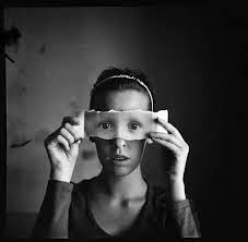
This photograph is one De Winne's portraits from her gallery album 'Queen Mab'.
In this image by Sarah Cheng-De Winne and he sketch that I've drawn, we see that the centre of interest draws us to the positioning of the girl.
She's been placed on the left. So the composition of this photo image has balanced well with the depth of space that's shown. It explains the deep depth of black and grey on the rest of the photograph. This creates an effect of separation between her world, or in other words, a split between how she sees her culture/identity than what others see.
The image has very lightly reflected if you look closely, kinda like vanishing points where space disappears into nothing but is 'just' there to see. Her face is looking from the bottom of the page to the top. This is when symmetry comes in. It's not equally symmetrical, but it's reflected/rotated as a 'different view'. The image is balanced as explained before, it kind of creates a mirror like effect, which brings in my theme of identity and two different views that differs a persons identity.
Though the dominating color is black, my eyes are always drawn back to the red on her neck and the red love heart on the lips. She has used color to outline or define the importance of feminism and how they define themselves as ladies. This use of color gives the photo a feeling of dull and cold (background) juxtaposed to the red expressions of feminism and the whole idea of putting yourself out there for people to appreciate and embrace.


Subscribe to:
Comments (Atom)